
Unit 8; Gen Z Anti-Consumerist Art
- Ryan Mckendrick

- Apr 27, 2020
- 10 min read
Updated: Jun 2, 2020
For this project I want to create a body of work which criticises contemporary consumerist culture, with exploration of advertisement and it's development in modern culture, and investigation into the environmental impact of our shopping habits. This post will explore a number of artists who create anti-consumerist and anti-capitalist art, analysing visual communication which I can apply to my own work.
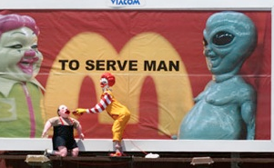
Ron English
Ron English is a street artist and designer who works primarily within pop-surrealism. His art has been coined 'POPaganda', making a lot of satirical pieces which mock current political events, consumerist trends and most popularly his works hi-jacking billboards. He works to a variety of media including print, sculpture and painting.
Here are some of my favourite pieces:


Visual Analysis:
I like the way English manipulates recognisable imagery such as his work criticising McDs, using recognisable imagery such as Ronald McDonald and the signature 'golden arches'. This imagery is reminiscent of symbols of American consumerism, while the manipulation of the images encourages the audience to question their association of these symbols.
English is creative with his media use in his design. For example his series displaying supermarket shelves, but with the products recreated as spoof products, which mock the issues the products have. This use of media directly relates to his overall concepts, strengthening the communication of the piece. Initially the audience sees the brands they recognise through logo, characters and slogans, but once they look deeper they see another meaning. Encouraging an audience to question what they know.
English also uses elements of of horror in his work for example when he manipulates the imagery of Ronald McDonald, to have a sneering grin, and white pupils. This evokes feeling of disgust in an audience, causing them to associate these brand images with feelings of horror and shame.
How can i apply this to my own work?
When creating anti-consumerist art considering manipulating branded imagery can create a very powerful piece for an audience. The recognisable branding evokes association, manipulation can then create double meanings for an audience and cause them to question their perceptions.
Like English, I think its important to consider how a designs format can further communicate a message to the audience. For example creating a spoof-ad, posting it on a billboard would not only be a bold design-choice, but would take advertising space from the original brand, further contributing to ideas of overthrowing capitalist ideals.
This would be pretty difficult to achieve so I could consider it on a smaller scale - creating spoof social media ads, featuring 'ads' in my magazine which are actually pieces themselves.
Check out more of English's work at popaganda.com
Richard Hamilton
Hamilton was one of the pioneers of the English pop-art movement, rising to fame for his works criticising 1950's consumerist and popular culture. I like the way Hamilton's work combines fine art, collage and pop-art.
Here are some of my favourite pieces by Hamilton:


Visual Analysis :
Hamilton became a symbol of the pop art movement with his works which incorporate pop-culture imagery with ideals of interior design, creating collage which represented the 'ideal' home life of the post-war pop-art movement.
I'm interested in the way Hamilton combines black and white images with imagery of the 'modern world' of the 1950s. This creates an idea of imaging the future with a sense of optimism which began to take hold of society in the aftermath of the second world war.
My favourite thing about these pieces is the idea that they once represented ideas of modernity and now they represent feelings of nostalgia, with vintage black and while imagery, retro appliances and technology, and 1950s interior design. Using popular imagery considers the idea of the longevity of a piece of work, how perceptions of it may change over time.
How can I apply this to my own work?
Like with Hamilton's work, I think its important to consider ideas of what is modern and what is popular and how this can influence the mood of a piece. For example in my designs I am interested in using grain and high contrast, because I feel it emulates the imagery of 1950s advertisement. But I need to further consider the reasoning behind desiring this effect - do I want to spark ideas of traditional consumerism, which began to take rise post-WWII? What impact does this have on my audience?
Combining contrasting images as Hamilton does with black and white nude models, with modern images of technology, can evoke feelings of double meaning within a piece. This could be useful when trying to make my audience question their perception of branding - maybe I could combine messy images of landfill with sleek images of the products which make up landfill, the contrast would draw attention and evoke interest in discovering another meaning.
Check out more of Hamilton's work via tate.org.uk/art/artists/richard-hamilton-1244
Vermibus
Vermibus is a contemporary street artist, popular for his critique of contemporary advertisement and part of the ad-buster movement. According to his biography he bases his practice on targeting the depersonalizing effects of advertising, which he negates by exaggerating them. Vermibus takes street advertisements and manipulates them, dissolving the face and skin of the poster models, smudging and blurring logos and slogans, and then replaces them in the street. His work is a critique of the untruth of manipulated images intended for advertisement.
Here are some of my favourites:


Visual Analysis:
Vermibus' use of media is really interesting to me, and I feel it contributes to a very powerful concept. By taking existing advertisement and replacing it where he found it, Vermibus is directly targeting the advertising agent as his audience, causing them frustration as they would need to replace the posters. Here he is directly fighting the industry he is criticising.
There are elements of horror in Vermibus' designs, twisting the imagery of typically 'beautiful' women dissolving their skin and facial features with acid. This creates a stark contrast between the original image and the manipulated image. Feelings of horror in anti-capitalist work such as these are powerful because they cause the audience to question perceptions, and evoke feelings of disgust in association with the branding and advertisement which surrounds us.
How can I apply this to my own work?
In anti-capitalist works I think evoking feelings of horror and disgust are particularly important because it causes the audience to experience strong negative emotions in relation to the ideas I am criticising. The use of shock, horror, shame and disgust is possibly the best way to cause an audience to question their actions - if they are disgusted by the advertising and brand images I have manipulated, they will begin to associate these feelings with the original imagery.
Again, Vermibus' work inspires me to strongly consider the media I use for an outcome, how can the media I choose directly influence the reaction of an audience? What associations will an audience already have with the existing media - for example maybe they see bus stop ads as something to read while waiting for the bus, then every time they are waiting for a bus and see an advert they will be reminded of the piece.
Check out more of Vermibus' work at vermibus.com/
Barbara Kruger
Kruger is is an American contemporary pop-artist infamous for her photography with text overlay conveying her ruminations of what lies within. She has a distinct style of black and white photography with coloured block-text overlay. Her work is often a critique of political issues and capitalist cultures.
Here's some of my favourites:


Visual Analysis:
Kruger's work has a very strong and consistent style, the repeated use of font and colour scheme makes her work instantly recognisable. Furthermore the stark colours with high contrast black and white, and bold red and white, make the pieces eye-catching. I think this is important in anti-consumerist art because as an artist you are mocking the culture of instant gratification, by which means when addressing an audience whom engage in that culture, the designs need to be bold and simple, to mimic the ideas of instant gratification.
Kruger uses text in a way I'm very inspired by, simple bold text is something I use in my own designs to add another layer of communication. Using text is often tricky as you don't want to overpower the images you're also using, but Kruger's text becomes the image through its design and format.
How can I apply this to my own work?
My initial designs for this project are quite overcrowded, for example images of landfill overlaying each other, it would be interesting to try and tone down a couple of my designs, similar to how Kruger has. To do this I would put a focal point on one particular image, Kruger uses George Bush but I could use a plastic bag, and then using editing and text to convey a message over this. I think this could be more effective than over-crowded designs as it is marketed to a consumerist culture, who expect instant gratification and not to study a piece searching for meanings.
I don't want to become too reliant on text in my designs, using Kruger as inspiration I want to explore the design of the text and how this can become the image. Furthermore, I may want to think about developing a consistent style, using the same font/sizing/colour palette throughout. Like Kruger's works this could develop the recognisably of my works and aid me in developing a consistent style.
Check out some of the current Kruger exhibitions at tate.org.uk/art/artists/barbara-kruger-1443
Steve Cutts
Cutts is a London based animator and illustrator, well known for his works commenting on contemporary society. Heavy influences of pop-art are apparent in Cutts' work, with a distinct graphic style.
Here's some of my favourite designs:


Visual Analysis:
Cutts has a really cool style, he uses traditional cartoon styles, with primary colours and smooth illustrations. I think this is useful when making anti-consumerist art because people are drawn to the playfulness of the design which contrasts with the darker messages.
Cutts also uses visual contrasts within the works, such as the fat cat illustration. The rich man is drawn with smooth circles, bright colours and shining object, whilst the poor men are emaciated, in darker colours. This contrast of colour and shape puts emphasis on the class contrast between the different characters. He's clearly thought about colour and shape connotations.
How can I apply this to my own work?
Although my chosen media for this project is collage, moving beyond the project I am considering how I can incorporate my darker digital style with my more playful hand-drawn styles (e.g Big Family Press). Cutts' work is an example of being able to create playful design with darker meaning. This is something I would like to explore further in future projects.
Cutts' work highlights the importance of colour decision in design, this is something i could think further about in my current project. For example in the fashion designs I think it would work better to use cleaner and brighter colours, and find a way to still discuss the darker side to the fashion industry. This would be more developed as it would consider the bright/clean designs of fashion magazines, and help me create stronger image connotations.
Check out more about Cutts' projects at stevecutts.com/illustration.html
Ben Frost
Frost is a graphic artist who evokes conversation about contemporary culture through his collages combining popular media and world issues, to create statement pieces. These pieces are from his popular series which features recognisable characters on the cover of prescription drug packets, a comment on the over-prescription of drugs in America:


Visual Analysis:
Like Ron English, Frost uses recognisable images to cause the audience to question their perception of this imagery. Frost's work however doesn't manipulate the characters, instead changing the settings they are in. I think this is particularly powerful as the works don't change the audience's perception of the characters, but makes them question the context in which the characters appear. For example d*sney is commonly associated with mass consumer culture, especially in America, when these characters are put against the prescription drug packets, we as an audience then question the wider consumption issues beyond simply buying things.
Frost's bright colours emulate some popular characteristics of pop-art, which can be seen in most of the artists I have studied here. Using colours in this way suggests feelings of happiness, while the concept behind the image is much darker. I think this is very important when making consumerist art, as we want the audience to question some of the 'happy' feelings that they get from typical brand advertisements.
How can I apply this to my own work?
Similar to Vermibus, Frost has thought about the composition of materials in his works when constructing them. This trend of recreating recognisable items seems to be effective in anti-consumerist art as the artist is able to directly target the product they are criticising. For this project I would like to think about how I can reconsider the products I am depicting, in order to make them represent the problem I am addressing.
See more of Frost's work at benfrostisdead.com
Research Conclusion
This research has been useful in analysing visual communication trends throughout popular anti-consumerist art, the key points being:
(Edit: How have I used this in my work?)
Using brand imagery/font/logo will make work easily recognisable to the audience, and can be used to directly alter audience perception of chosen brand imagery. In my McMurder mini series I did this by researching popular McDs ads, to then create my own versions with similar imagery. I used the recognisable red and yellow colour palette, and manipulated the logo to say McMurder. This was successful as I was able to clearly suggest the issues I was discussing were related to the brand whose imagery I was using, through visual associations. An audience is able to immediately identify the subject of McDs, and their perceptions of the brand can then be altered.
Considering the meaning of chosen media is important, through this you create a piece which shows a double meaning, at first the audience recognise the product and then they are able to analyse the changes, questioning their perception of the product. When creating pieces for the Fashion mini-series, I looked at fashion ads from sites such as PLT and ASOS, noting the simple and sleek design used when advertising clothing. I feel I emulated this in my own designs, by taking model images and changing the texture of the dress. E.g. when discussion the industries use of oil, I made the dress seem like an oil spill. This was useful again because of audience associations, making them reconsider what they think they know, and asking them to question what they see when they next see the product.
Text needs to be bold, and needs to become part of the image. This will improve the visual communication of my work and focus on the audience. If my intention is to change the mind of the consumer, I need to advertise to the 'consumer'. In consumerist culture there are ideas of instant gratification, and bold and simple being more eye-catching. During the development process I experimented with text use, and style - such as drop shadows - deciding on using the same bold text in either black or white throughout. Through other design decisions such as borders, I feel this aided my text in becoming part of the image, creating stronger visual imagery.


Comments