
IPS Process
- Ryan Mckendrick

- Apr 28, 2021
- 21 min read
Updated: Jun 4, 2021
This blog post covers the creative process throughout my IPS project, Curating Queer. the brief and proposal can be found here.
Font Creation
When conducting my research into queer publications, I identified a key design element of creating a published print was a unique font title for the cover. This allows for brand recognition between prints and is therefore beneficial when branding and generating audience.
Examples


I specifically like Drome's front use, taking a traditional style to create a font which becomes part of the image through it's dramatic design.


Thinking about creating my font I can consider different styles of font, such as handwritten, black letter, comic-book, or bold. I do find I prefer the bolder styles of font as this is more unique and eye-catching when considering creating a memorable font.
Experimentation

This initial font test explores a bold and colourful font, which follows the colour scheme of the inclusive pride flag, put against a background of warped floor plan maps. This was to connect the two ideas of space creation and LGBTIQ+. When comparing this with my work from the course project which focused primarily on collage, I feel a lot of my style and skillset is lost in the above design. Instead I reconsidered, and thought about making a collaged font.

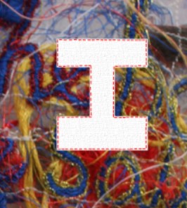
I then created this using found text from magazines and newspapers, I felt this was a lot stronger and it allowed the tactile element I admired in my Course Project to continue into my IPS.


Pushing this further I collected and photographed an entire alphabet. This was a vital stage as it ensured I would have the lettering needed for use throughout the print, which would allow for a cohesive style.
Final Font

The final font keeps the tactile style I am beginning to develop within my work, and uses pops of colour to relate back to the themes of LGBTIQ+ inclusivity. I feel using collage relates further to the idea of curation, allowing for the selection of font and imagery to curate my own pieces.
Launching the Project
Whilst the primary aim within my initial project proposal was to speak to London Queer Space creators, as I reached out to different spaces around London, I realised I was getting very limited responses. Spaces were either busy with issues surrounding the Coronavirus pandemic or not interested. While I had a couple of great responses which accompanied interviews to support my dissertation, the response base was underwhelming compared to Identity in Mind. I decided to reconsider what 'space' really meant, and open up the project to all queer creators, with the idea that space can be created and curated by any means.

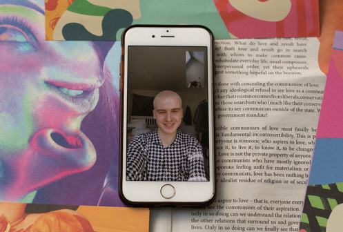
I created this image with the intention of using it as a promotional post for the project, however considering my concerns about being more image-centred and less text-based from Identity in Mind, I recreated the image as below.

I decided on the background photo from Gen Z magazine, as the idea of flats and houses fit within the idea of individual space which ties within space created by artists.

Using Instagram ads I was able to curate my audience and participant base through interests in creative subjects, LGBTIQ+ activism and social movement, and similar LGBTIQ+ publications. I kept my audience location within the UK to allow for a shared experience between participants, but opened it up to any age and gender to allow for a level of inclusivity.


I used the post to share info about the project, and created a 5 day promotion which was successful in gaining a total of 22 participants. - 5 more than Identity in Mind. The plan was to interview and photograph the participants over video call, and curate their space through collaging their photoshoot with examples of their work and segments of their artist statement.
For ethics reasons I required participants to complete a consent form which covered different sharing preferences, pronouns, and privacy consent which allowed me to safeguard the participants of the project.
Photoshoots
Beginning this project I knew the photoshoots would cause a huge illustration problem that needed to be solved - how could I create shoots throughout a nationwide lockdown?
To overcome this I went back to my inspirations for my summer project, Identity in Mind, in particular Jesus Lacalle's 366 portraits.
Throughout 2020's first lockdown Lacalle ran shoots over skype and Facetime, adding a new dimension to photography, one that visually connected the subject and photographer. I decided to consider a similar format to Lacalle, running my photoshoots over video platform.
Test Shoots


I began by running test shoots where I explored playing with the camera setting in terms of brightness and exposure, and experimented with layout. Through this process I realised that doing the shoots in this manner meant the phone became part of the photographed subject, so should therefore be treated as such in the shots. For this reason I felt the shots that didn't include the entire phone were not framed as well. There also became issues with quality, which would have to be adapted case-by-case. This is as some people's phones have lower resolution, for these shoots I would have to play on the low quality and tie this within the concept. This is something I experimented with in the text shoot by playing with glitch art for the backgrounds, to emphasise the low resolution of the image subject.
Queer Culture Club
My first shoot was the creators of Queer Culture Club, Ellie and Jessie. I had already interviewed Ellie and Jessie as part of a formal interview for my dissertation, so had an idea of their aesthetic before the shoot. The pair shared ideas of QCC, a queer women's collective, becoming a space and community for queer women. We spoke of representing femininity in the queer community, and providing sober spaces and events such as picnics, camping holidays, and poetry nights. I wanted to capture Ellie and Jessie's imagined world of nature, literature and inclusive femininity in the shoots, using found imagery of nature, a single red rose, and snippets of book pages.


Taking directive from my test shoots, for this first shoot I focused on framing the phone as part of the subject, using the flower to add another dimension and positioning the phone within the image as central.


I wanted the shoots to follow a cohesive theme, using similar sets for the two seperate shoots. Something I like about the results of these shoots was as both Jessie and Ellie were captured in their bedroom, there was an additional sense of intimacy, when combined with the considered set, this allows for an audience to see both the space they inhabit, and the space they aim to create within the shots.


From the shoot I created some collage with the aim to create Instagram promotions to launch the project on social media. Thinking back to my own critique of Identity in Mind being too text dominating. I wanted to refine Jessie's post to only contain her name. I felt this would also create a level of interest from an audience, by saving sections of our interview for release.


Ellie and Jessie's posts followed the same layout to allow for a coherence and a connection to be made adjoining the pair. Using my created font I featured their names in parallel placements to create a versatility.
Mason Kane Thomas
My second shoot was Mason Kane Thomas, as Mason was an artist as opposed to a space creator, I operated our shoot/interview differently. To allow for more image-focused work, I kept the 'interview' aspect of these shoots informal, not recording the interview but instead asking questions to help me understand their work when curating them. For the recorded element of this, I asked participants to create a short artist statement based on the below prompts:
- Who are you and what/how do you create?
- How do you feel your art intersects with your LGBTIQ+ and/or intersectional identity?
- How do you create space within your practice and what do you aim to achieve?
I felt this allowed for a freedom for the individual participants and allowed them more control and power within my curation of their space. I also asked artists to send me examples of their work to use for collage.


Mason is a fashion designer based in Sheffield, their work is primarily monochrome, and in interview Mason mentioned being inspired by 80s Queer culture and protest culture combined with brutalist architecture.

For Mason's shoot we shot against photographs of brutalist architecture, I liked the contrast of the orange lighting from the shoot, however both myself and Mason felt it didn't fit within his work, so arranged a reshoot.


For the reshoot we incorporated the monochrome theme into the images within the phone, with the subject wearing monochrome in a simple colour themed background. We both felt that these images represented Mason's artistic practice stronger when compared to the initial shoot.


Collaging Mason's photoshoot and work I focused again on representing the monochrome theme, collaging elements of his work with overlaid handwritten text from their artist statement in which they described the garments they make as for 'creatures of beauty.'

Mason was really happy with the final result and shared it on their Instagram using an interesting format which split the image between posts creating a disjointed style I found interesting.
Shiraz
Shiraz is a lingerie photographer based in London, in interview Shiraz spoke about using her work to challenge who is behind the camera during lingerie shoots, focusing on the idea of a female gaze. Shiraz aims to celebrate diversity, all body types, and queerness within her work.


I wanted to capture a similar theme of bodies and the female form within our shoot, choosing to shoot against life drawing paintings by an artist called Nat, featured in Gen Z magazine.
I felt this piece translated similar themes to those in Shiraz's work, thinking about body shapes and intimate shots of bodies.


I also shot against pastel purples and blues found in Gen Z, as I felt this complimented the colour pallete Shiraz brought to interview.


For Shiraz's collages I thought about capturing the softness that Shiraz captures in her own photography through pink hues. I experimented with overlaying the model from her own work, playing with opacity to create the movement translated in the images of kissing women. I also incorporated segments of Shiraz's artist statement, playing again with this idea of collates moments that was present in my course project.
Ian
Ian is a content creator and make-up artist based in London, who over lockdown has begun to explore poetry as a means of expression for frustrations with racial issues. Ian's work is bold and unapologetic, their make-up looks demand attention, in interview they discussed this as a means to oppose toxic masculinity and gender binaries.


When curating Ian's shoot I wanted backgrounds which were bold and colourful, and represented their practice as a make-up artist.


We shot against colourful backgrounds which coincide with the make-up looks Ian had decided to share. I also chose to use a piece by an artist from Gen Z Magazine called KMC, a painting of a woman with exaggerated make-up, as this fit well with Ian's artistic practice.


Collaging for Ian, I wanted to focus on how they create space as a creator through social media, collaging their art into a phone screen, alongside pixelated hearts, and a segment of their artist statement represented through an instagram message. This reinforced the context of the space which Ian's art creates.
Jamie
Jamie is a poet based in Northern England, their practice allows them to create space to process their emotions and moments of turmoil. Their work is shared primarily through social media platforms, which presents similar themes to Ian's work.


Jamie's shoot was very high energy, and in interview he expressed a desire to be represented as impromptu and away from a professional context. For this reason I created a street style set, using photographs from Gen Z of public transport and and night outs. We combined this with pieces of handwritten text which related back to their practice.


Creating Jamie's collage, I returned to the imagery used to create his shoot, combining this with a notes-app write up of one of his poems. This allowed for a comment on where Jamie's poetry exists, on media and digital platforms. However I felt that my curating of Jamie's poetry didn't push myself enough as a curator as it simply combined 2 images. I decided to return to my curation for this piece, thinking about how Jamie's poetry is primarily shared through their digital platforms.

Initially I edited Jamie's poem into a phone screen against a homeless charity newspaper, Dope, with illustrations from Rebecca Hendin, a London based Artist and Illustrator. I felt these pieces representing the urban vibe that Jamie noted they wanted from the shoot alongside the haunting themes of their poem, Hollow Ground.
I felt this piece needed further development, thinking more about how art is shared on visual platforms, and thinking about Jamie's themes, I decided to explore creating digital clitches within old school internet explorer interface.

Using copied interface such as above, I explored creating glitch effect using a tutorial from Diego Sanchez. I used this to create the below image which I think combined visual thematic and conceptual elements to represent the digital elements of Jamie's working class urbanist inspired poetry.

Melis
Melis is a multidisciplinary artist who primarily works in photography and collage. In interview Melis discussed creating a comment on sexuality and addressing explicit imagery surrounding sexuality, within the context of her Turkish heritage. Her work attempts to subject the taboo and regain control over female sexualisation.


Melis asked for our shoot to fit within the theme of her most recent piece, Girls Will Do Anything For Love, a collaged photo-book primarily set in pink tones. Melis also requested we play with light and colour within the shots of the phone itself, to compliment her own polaroid photography.


Following Melis' direction we stuck to a pink colour palette. Throughout my shoots I gave participants 8-15 options of the final shot which allowed them control in how they were represented.

Together we chose the above image, feeling this aligned most with the visual themes of Melis' work.


Creating Melis' collages, I wanted to keep as much of the original pieces as possible as I didn't want my own collage to detract from the original work. Instead I sat the scan of the book within the collaged piece adding a depth to the pieces. In alignment with Melis' own text usage, I incorporated the segment of Melis' artist statement by clipping elements of the text, applying texture filter to imitate book paper pages.
Joseph
Joseph is a genderqueer creative, who works across the board within acting, writing, and zine-making. Originally from Grimsby and based in London, Joseph’s work explores phenomenological experiences of blurring the lines between dreams and reality.


Joseph's work primarily focuses on nature, capturing vintage-aesthetic polaroid shots which recreate experiences through strong colour use. This is something I wanted to capture in our shoot, deciding to use The Sky Trembles and The Earth is Afraid, by Ben Rivers, a book which documents the making of his 2015 film through photography of his Moroccan adventure. I felt both Rivers and Joseph held similar themes within their work, as Rivers' film is described:
Shooting against the staggering beauty of the Moroccan landscape, from the rugged terrain of the Atlas Mountains to the stark and surreal emptiness of the desert, with its encroaching sands and abandoned film sets, a director abandons his own film.


Collaging Joseph's work I wanted to play with the composition of the polaroid's, rearranging the images to exist across multiple frames, I also wanted to incorporate the elements of darkness within Joseph's work, using black background for the shots.


Eleanor
Eleanor is an interdisciplinary artist who primarily uses craft and textiles to communicate their personal experiences of queer identity, community, and relationships. Through practices of quilting, embroidery, printmaking, and crotchet, Eleanor creates work which aims to resonate with other queer folk.


Shooting Eleanor, they answered our call all in pink, something which reflected strongly in their work, this pink theme is something we discussed as important to Eleanor's work which plays with gender roles and stereotypes. We decided to shoot using primarily pink magazine pages.


I used background work from artist Scarlet Brown, who plays with bold colours and pink tones. Editing the photos I explored enhancing the pinks and magentas, to emphasise Eleanor's artistic quirks.


Editing Eleanor's work I wanted to incorporate the stitchwork element of Eleanor's craft, 'stitching' together the different pieces they sent with digital collage. To do this I followed a photoshop tutorial to make my own embroidery brush.
I used this to 'sew' together the elements of the collage, and create text based on Eleanor's artist statement, applying a canvas filter to the brush strokes to emphasise the texture of thread.
Al
Al is a transmasc textiles artist based in London, his work focuses on the domestic aspect of queer identity questioning the spaces we inhabit as queer folk. Al’s work aims to unpick the feminine gender assumptions of practices such as quilting, weaving, and embroidery, recoding textiles through a trans narrative.


Al's work was colourful and messy, which is something we wanted to incorporate into our shoot, using graphic work from Scarlet Brown which recreated this.


Collaging Al's work I wanted to keep this element of messiness, by layering Al's work, and touch on the themes within his work. Al's work primarily uses embroidery to create text based pieces, this is something I tried to recreate in my curation of Al's work, using segments of Al's artist statement and adding texture and stitch marks using the stitch brush from Eleanor's collage. This kept the collage text based reflective of Al's work.
Sophia
Sophia is a mixed media artist from Kent, who primarily works with poetry and collage touching on themes of queer adolescence, mental health, and the male gaze. Sophia resonates within the sapphic identity and enjoys addressing issues of queer guilt and sapphic fetishization.

Interviewing Sophia, we wanted a collaged look that she goes for within her practice, I used background work from Freya Moran, a collage artist based in Edinburgh, looking at warm colours which convey senses of nostalgia which are inherent within Sophia's work.


While shooting I was inspired by Sohpia's bedroom walls, which were crowded with posters, photographs, leaflets, and train tickets. To curate Sophia's work I wanted to add this element of crowded collage to contrast the minimalist collage in Sophia's poetry presentation.

I did this by layering photographs of Sophia's bedroom walls and removing the background so the images overlap one another.


I then layered Sophia's poem and portrait over this, creating contrast between the hectic background and minimalist imagery.
Alex
Alex is a queer poet based in Brighton who prefers to explore the confessional side to poetry – “to open the sluices and see what pours out.” Alex writes to filter their experiences, as a nonbinary, queer, depressed optimist, describing writing as a necessity not a choice.

Alex's work is powerful and well written, in interview we discussed Alex being quite bookish, and feeling their queerness manifested through softness and literature. To represent this we used aged book pages from The Sky Trembles and the Earth is Afraid.


Curating Alex's poetry I wanted to create a similar aesthetic, originally attempting to layout the poem, Her, over aged paper.

I didn't like the way this looked, as the text and the paper felt too seperate and too obviously photoshoped, so I instead used photography of The Sky Trembles and the Earth is Afraid from our shoot, to overlay the text as though it were a part of the book.

I felt this wont, and the font matched the font Alex had used in the original poem, as this translated a printed literature theme.

I kept the portrait of Alex minimalist, only using the book pages as I felt this was representative of Alex's personality expressed in our interview.
Bridey
Bridey Addison-Child is a poet and audio producer. They make sound art, installations, documentaries, and other weird little sound things. They are currently working on a doc series about drag kinging and trans/AFAB masculinity and are interested in exploring issues around gender, butchness and queer bodies as a way of expressing and exploring their own experiences, as well as creating a space for people to talk about and understand the diversity of the queer experience.
Bridey's work had strong themes of nature and beauty alongside ideas of the weird and wonderful, which is something we wanted to combine in our shoot. I showed Bridey some of the pieces I was using for the shoot, and allowed them to choose their favourites to create the set. We chose to use work from collage artist Freya Moran, pop artist Michael Hugh Joseph, and illustrator Clara Grace, as we felt these artists combined the themes of nature and obscurity which was present in Bridey's work.


It was difficult to think about how to curate Bridey's work as it primarily exists as sound pieces, however I was inspired by the themes of nature in Bridey's process, and visited their production videos and photographs from Field of Sounds to think about a visual curation. Bridey primarily uses Vimeo to share their pieces, so I wanted to replicate the Vimeo interface in the curation.


To curate their portrait, I needed to create a landscape piece to fit with previous participants but had shot Bridey mainly in portrait, so I layered their shoot behind previous shoots using similar artists. The final piece was changed upon Bridey's request to use a portrait which they preferred.


Ejel
Ejel is the creator of the @muslimlgbtnetwork, a digital platform which aims to bridge the gap between LGBTIQ+ and Muslim communities and provide a hub for LGBTIQ+ Muslims in need of support and advice. Ejel’s work is inspired by his own experiences as an LGBTIQ+ individual from a Muslim background, and he strives to make a better future for the next generation of LGBTIQ+ Muslims.
Ejel was one of my first shoots, so there was not as much thought behind our set background, and for that reason his images did not come out as strong as the others. Furthermore, as he was my first shoot there were a couple of technical difficulties which negatively impacted the exposure, brightness, and contrast.


To fix this I got Ejel to send me a selfie as he was unable to arrange a second shoot with me, and I reshot this.


I was still unhappy with the shot, so decided to edit this on photoshop to match the other formatting. I edited this to include the small picture both of myself shooting, and using a colourful and bright background which reflected in Ejel's pride-flag themed digital platform. Using work from Hannah and Anna, and Visuals by Simm, created that similar background reflective of transflag colours.

Curating Ejel's background was tricky as his space was virtual and difficult to visualise. However The Muslim LGBT Network primarily finds it's home on Instagram, so I thought about using similar formatting to an Instagram post to curate Ejel's space.

To do this I thought about how Instagram posts are formatted when shared on stories, with the gradient Instagram background and contrasting white layout.

Using a screenshot of Ejel's platform, I recreated this layout, adding some glitch effects that I had learnt from the tutorials used to make Jamie's work. This enhanced the themes of technology present in Ejel's space. I used the Instagram interface to incorporate segments of Ejel's interview.
Emmy
Emmy is a digital portraiture artist who uses art as a respite from the intensity of her daily grind and a way to connect with her wider community. Emmy’s work primarily focuses on the female form, allowing her to explore her own complicated relationship with femininity.


Using photoshop as their primary medium, Emmy described herself as having a contrasting personal style, dark and bold, to her work, often softer with brighter colours, which we wanted to represent by creating a contrast between out shoot and curation.


Like with Bridey's shoot, I shot Emmie in portrait, so when curating this I had to overlay the portrait with a larger shot from an artist we featured in our initial shoot, Nia Lilian - feeling her work represented the dark and moody vibes Emmie wanted to capture in our shoot.

When curating Emmie's work I wanted to focus on the space in which Emmie creates through photoshop. Thinking about consistency between participants I wanted to use similar old school interface to Jamie's curation, choosing to use old school photoshop interface. To do this I initially collaged Emmie's work to overlap pieces, alongside text from her artist statement, then positioned this within elements of old school Photoshop interface.


Fred
Fred is a textiles designer and filmmaker studying at CSM, who uses his practice to find serenity within the chaos of the everyday. Fred’s work can be inspired by anything, from litter in the street, to socio-political events.


I think there was something really interesting about the way in which Fred's work contradicts itself with the contrasting chaotic pieces and minimalist collections of brightly coloured items. This is something I wanted to consider in curating Fred as an artist.


For our shoot I overlaid Fred on brightly coloured backgrounds by Visuals by Simm, with contrasting monochrome segments of text, which in turn contrasts Fred's monochrome outfit for the shoot.

Curating Fred's work I was reminded of busy walls in urban areas, covered with graffiti and pasted posters, such as the below wall in London's Shoreditch.

To recreate this I converted the simplistic pieces from Fred's collection into pasted posters, using overlay effects to change the texture of the images.


I then laid these over images of Fred's busier walls to recreate that graffiti wall effect and emphasise the noise contrast in Fred's work. I created 2 versions of the final image giving the choice of B&W and RGB to Fred, he chose the coloured image as the final collage. I also overlaid text from Fred's artist statement in a painted font to further enhance that graffiti wall effect.


Iris
Iris is a multimedia artist with absurdist work which focuses on themes of the uncanny, childhood, queer identity, and self-form. Iris’s work allows them to explore feeling alien within one’s body and address a feeling of otherworldly ambience that can come with exploring gender.


Iris's work combines grotesque imagery with the weird and wonderful, the main themes seem to be the morphing of the human form, considering how human form can merge with other forms, and heavy notes of greens.


In our shoot I used work from graphic artist Ryan Michael and photographer Molly Cairns, who I felt merged grotesque imagery and complimentary green tones.

I wanted to combine these elements in my collage of Iris's work, by morphing the imagery they sent, and enhancing the green tones.

J Frank
I am a queer body and a queer mind, exploring intimacies, the ephemeral and relationality in regards to that body. To document is to exist, and through the archiving of my own trans* experience I become. To write and rewrite the narrative through being and making, to grow, observe and reflect. To look amongst the queer bodies around me, listen and absorb and share, to be present, to be, to. Through making I hope to fully realise my own experience as a trans* being: when I am queer I am. My art is made up of fragments of acknowledgment, exploration and celebration of this.


J Frank's work has 2 distinct contradicting styles, from the clean bold graphics, to more haphazard graffiti style. Curating J Frank's work I considered how I could combine these two themes.


Creating our shoot we chose strong thematic colours from J Frank's work, pinks, blues and purples, combined with more messy pieces such as the painting by Tilly Abbot.

Collaging J Frank's work I considered the contexts of his pieces, and again was brought back to the walls of Shoreditch from my collage of Fred's work. I felt the graphic poster style illustrations would work well 'pasted' against the background of the graffiti style piece.


using the same techniques gained from the tutorial used for Fred's work, I converted J Frank's graphics into pasted posters. I then layered these over the graffiti image.

Luciel
Luciel is a mixed media artist based between Germany and France, whose work allows them to document hurt and joy through a mixed media approach. Luciel describes his practice as for himself, a contrast from his curation work as the founder of art collective @kreativkollektiv123 a digital space for queer artists with aims to bring artists together, share projects, tips, and advice.
Like Ejel, Luciel's space is primarily digital, existing through Instagram as a virtual collective. This is something I wanted to capture in my curation of Luciel alongside aesthetic themes from his personal practice, which captures intamcy through a soft and pastel coloured approach.


In our shoot we wanted to capture similar colours using blues, whites, and pinks which also reflect the trans pride flag and Luciel's identity. To do this I used work by Visuals by Simm, Michael Hugh Joseph, and Will Moxan.


Curating Luciel's work I wanted to again play on the space in which Luciel curates, on Instagram, and so played with the mock-up Instagram post. I originally used the below piece to curate, but felt this didn't compliment the colour scheme used for our shoot.

I instead reworked the format, revisiting our shoot pictures as a template for this. I felt this curation both complimented Luciel's work while incorporating themes from his curation practice.


Sam
Sam is a performance and fine artist who primarily works within photography and painting, his work takes an abstract style when mixing bright and muted colours with elements of comedy, to create work which represents ideas of campness. Sam’s work comes from an inherent need to create, utilising mixed media as a form of expression to help him process understandings of both himself and the wider world.


Sam describes his work as bold, colourful, and experimental, contributing to his thematic aims of representing camp. In our shoot we wanted to capture this playful energy, combining patterns, textures and colours from artists such as Michael Hugh Joseph, and Hannah and Anna.


Curating Sam I wanted to touch on his diverse practice in film and performance, choosing to use a film reel template to curate the images as though they were strips of a film and inserting text samples from Sam's artist statement.


Oscar
Oscar is an artist, filmmaker, and photographer based in London, who uses their practice to narrate ideas of performativity through a digital lens. Fascinated by ideas of performance within the everyday, Oscar’s work takes an emphasis on selfhood to tap into a universal collective consciousness.
Oscar's work has a lot of heavy green tones, and utilises outdated technology and technological glitch to enhance the absurdity of their work. This is something we tried to capture in our shoot, using work from Visuals by Simm, and Scarlet Brown, who both hold similar themes in their works.


In alignment with the themes in Oscar's work we tried to capture a sense of mundanity in our shoot, capturing shots throughout conversations and using props to keep the shoot candid.

When curating Oscar's work I used stills from some of their different film projects to work from as imagery.


Playing on the contexts of Oscar's work I then used the tutorial from Jamie's curation to create a VHS effect over one of the stills, adding text saying 'play' and their artist statement to expand on this.

When presenting this I felt I could push the curation further, so explored how Oscar uses their work to create a space over their website, oscarcannon.com

Oscar uses elements of old school Internet Explorer interface, similar to some of the elements I used in Jamie's shoot. To play on this I considered the glitch effect of using old school internet explorer and moving a tab, as below.

To create this effect I layered other screen grabs multiple times as duplicate layers, positioning the central collaged screen gab as though it is open in a mass of open files. I then layered this within elements of interface that would enhance the effect.

Creating Print
Going to print creation I decided to use the programme Bookwright as this allowed an ease of printing and formatting. I knew after my project Identity in Mind, that I wanted this project to be heavily image based, so decided to make the images the central focus of the page layout.

However in order to keep the participants in the central focus of the page - not the page break, I decided to add a line of white which would allow me to add the text from their artist statements in a subtle way which would still allow for images to dominate the overall page.

Creating the artist statements I worked on the long 3-4 paragaraph statements from participants, and crafted this down to a singular paragraph. As there is a large number of trans, GNC, and non-binary individuals within the project, I also added their pronouns. The artist statements also credit the numerous artists used for collage.

I then repeated this process for each individual.
I then began to create the front and back covers of the piece. To do this I though about how I have used Instagram throughout this process, and the way which my participants are documented and celebrated on my Instagram platform.

I recreated that by formatting an image of every participant or their work within the block square format.

I then created a title and author by using the same text consistent throughout the project, adding a slight fade to the background images to ensure the boldness of the title.

Following similar formatting to Identity in Mind the back-cover stayed minimalist, including only a smaller version of the cover image, and my Instagram handle, alongside room for the barcode provided by my chosen printing platform.

To contrast the heavy image based formatting of the interior magazine, I chose to keep the inside cover white, using only text introduction in the same format as the artist statements.


Comments